Design - Adding Points (Part 1)
The Logic Point
A Logic point can control the visibility of multiple points . The Logic point can also output values , both numeric and text data, based on the same conditional logic processes that display points. The Logic point will test whether a condition is either true or false, or indeterminate, and output values assigned to these outcomes. Supports AND and OR operations , allowing two comparisons to be made at once. Usually two inputs should be enough, but if more complicated expressions (eg A or B and C) are required, several Logic points can be connected together. While the output values drop lists provide for True, False, Yes and No outputs, any strings of numeric or text values can be output, including sentences. Each Logic point has a given source and a condition to test, eg testing if a Yes/No point titled 'Have you ever smoked?' was equal to 'Yes' then appropriate questions would appear and if 'Smoke Per Day' was greater or equal to 10 cigarettes, the Logic point would record 'Smoking history', as shown below. Conversely, with 'Is this an anonymous interview?', if the answer was 'Yes', then the Edit points for interviewee name and other identifying details disappear. Please download the Logic Test project shown below to examine the logical structure.

Eight different logic Tests can be applied. The dialogue box above shows some default Test responses, though any text or numbers can be used. Logic points can also test the dynamic value of two points by applying the test to the other point by enclosing the point IDName in <% %> , this can be useful when comparing initially unknown values, for example two bar code scans. Following selection of input points and tests, the 'Show' points are selected with a double click, the pink tick and red text identifies they are Logic point targets. Logic points are not visible on the page. Given the Logic point is not visible, it can also be operating in the background without displaying points but transforming and outputting data. To output values/data , the Logic point must be given an ID Name and its Style must be checked for Include in Data .
For a point to be a Logic point target for display it must have ' Visible on Page ' checked for its Style. The Logic point then suppresses this visibility, unless it is unlocked by meeting data tests. All very logical, and delivering a lot of power on the mobile device.
The Logic point can be used to test a security code to show the Contents page links for a project (with pages unchecked for access via Previous and Next buttons), and to display specific points for confidential data. If the Logic point is used for security of a project, the Edit points used for input of code should be unchecked for ' Include in Data Store ' so the links and points 'disappear' at the end of the session, as intended.
The Sketch Point enables drawing a sketch on the mobile device with a stylus. Sketches can be drawn in colour using either an 8 or 4 colour palette, or drawn in black.
Sketches can also be drawn over JPG or PNG images imported into the Sketch field, either in project design or on the mobile device in the field via Camera and File points, providing a wide range of graphical recording options. The design dialogue box shown below shows options for sketch management.
There are a wide range of options for sketch format that can be set in Design mode, both for number of lines and fixed dimensions; see Canvas size options below. For a signature box, 5 lines is correct for most screens and more lines can be added to take notes. The lines option will wrap an image that is received from a Camera point to enable sketch on the image, whereas set sizes (eg 640x480 pixels) will manage an image to that size.
Colour Palette offers eight, eight plus white and four colour options, and no palette for black. A colour is selected by tapping the colour before drawing with the stylus or finger.
Clear Sketch enables clearing of the contents of a sketch either by an Eraser in Android and Apple or in Windows Mobile by a screen tap with the stylus and hold for about two seconds, the tap can be on the colour palette, or on the sketch line to be cleared.
Use of the Sketch point on capacitive screens may require a capacitive stylus for accurate lines.
Load Background Image from either a Camera or File point enables dynamic change of the background image, either when opening a session or from within a session.
Sketch on Camera (or from Gallery) image is useful for many purposes; for example, identifying persons in a group, damage assessment for motor vehicle and property insurance and repairs.
On high screen resolution Tablets and Smartphones,Google Maps andEarth images captured using device screen capture (eg on Apple iPad and Samsung Galaxy Note) can be imported from Gallery to sketch on the map in the Sketch point.
For convenient results with Sketch images, export into HTML, where the images will be presented in HTML pages along with any data collected.
In databases, image files will record as 'Long binary object' and be available for use in all major databases (see page 11 of Skills).
The Link Point establishes navigation links, as for web pages and sites. For lengthy projects, using the application on the mobile device is easier if the project is broken out into pages for each major subject area. For example in the Breathalyser project six pages were set up with the Breathalyser page presenting the top level navigation. The design dialog box below shows the simple procedure to set up a linked navigation point. In addition to being useful for top level navigation pages, links can be used on any page to make a quick 'jump' to a relevant area in the project, and back again. The link functions complement the standard Previous and Next navigation functions present on each project page on the mobile device. The Launch URL hyperlink can be used to link to the Internet, for example www.mobiledataanywhere.com or to a file on a mobile device if the location is known.
Options for the Link point enables a hidden Link point under the control of a Logic point (see below) which can 'jump' automatically to another page if a Logic point condition is met. Similarly, a hidden Link point on the target page can be used to return to the original position in the project. This 'jump' function can be useful for market research surveys and many other projects. While the set up of the associated Logic point (see below) will generally be obvious, the Test for a jump for any entry to a point is 'not equal to'....'blank'...that is, nothing in entry box.
In addition to a standard text link, an Image button can be a inserted. If an Image button link is used, the point caption can be removed as the standard text link is not necessary. The layout of Link, colour and size of Link font can be controlled, with increased size important for use on Tablets. Image links are centered on the page.
Dynamic navigation can be achieved via the Link point using <%PointIDName%> as the URL, and to action functions on device, eg to phone a customer on the way to a job using tel:<%BusinessTelephoneNumber%> , where 'BusinessTelephoneNumber' is the ID name of a point containing the number.
Contents Page can be automatically generated providing links to all pages in a project, this function is found under Edit on the design window toolbar.
The Layout Point enables either Images or Text to be presented on the project page, at any position. The Image Layout Point supports the insertion of JPG and Bitmap images . While the example shown here is a black and white identikit image, colour images can be inserted for maps, charts, plans and other requirements. Supporting guidance information can be added to the guidance box to elaborate on the image. The dialogue box for an image layout point is shown below. JPG images are generally small, whereas bitmap images are intrinsically large files, best prepared in 256 colours and 8 Bits format. Images may add substantially to the size of a project file.
The Text Layout Point is used to add text to any position on a menu page, including for image captions. Check text font accepted on mobile device before selecting font.
The text component of a Layout point has the advanced potential to include references to other points in the project, in much the same way that a Math or Logic point is able to reference other values. This can be useful where the value filled into a point in one part of a project needs to be displayed elsewhere, or formatted into a text message. To include a reference to another point's value in a 'Parsing' Layout point , enclose the other point's ID Name with <% %> , for example, to reference the point 'Age', a Layout point could contain: 'John is <% Age %> years old'. If the value '33' was entered in the Age point, then the Layout point would read 'John is 33 years old'. Any number of points can be referenced from a Layout point, see Table example below, and set up in Text box.
Formatter point enables pieces of information to be combined and formatted into a string, based on certain formatting parameters. This string is then made available to other points for processing (eg Math, Logic, plus Session List Columns and Session Identification) and for output via the Data Pathway.
The Formatter point itself does not appear on a page, it is always invisible. Its value / string is always accessed from other points, eg the Layout point if it is to be displayed.
The properties dialog has a format string editor, which includes a helpful token inserter. This allows points to be chosen from the project graphically and inserted. To operate, simply place the cursor where you want to insert, select a point name from the list, choose the formatting specifications you desire (string or number, width, precision), and tap Insert.
The format string follows the standard used in the Layout point and point captions for parsing. Point names are enclosed in <% x %> where x is the point name. To add space between items, just add some > eg < . A constant value or text can be included in the format string by reference to a 'hidden' Edit point with data set as default.
Additional numeric formatting features are enabled by placing some brackets after the point name, eg <% x(8.3) %>. These numbers tell the point to format to 8 characters, with 3 decimal places. So the number will always look like XXXX.XXX. Leading and trailing zeros are added. The first number is the width, the second the precision. Both are optional. Strings can also be formatted to length, eg <% x(10) %> ensures the string is at least 10 characters long. If necessary spaces are added to the left (padding).
The Formatter point can be used to expand detail in Session Lists in the Session Window in Apple iOS, gathering data from multiple points.
The File point , can be used to store a file within a session, to be extracted later, launched or output to another medium.
In design mode a File Type filter can be selected, such as 'All Files', 'Image Files', 'Text Files', or a custom file type filter. File point can be set to automatically import or attach the newest file of a designated type (eg xml) in a designated folder. For some projects storing of a file in the project at Design stage may be required; this can be enabled by importing the file to the point and then using Save Default Value by right mouse click on the File point in the Point Panel. The file will be retained as default.
The File point is used by tapping on the point or one of the file control icons on the right of the point, Launch/view , Save or Open , and, if automatic is not selected, then selecting an appropriate filename when opening or saving. The Launch/view button appears and can be tapped when there is a file stored in the point, it will extract and open the attached file automatically, using its default handler. For example, an attached image file would launch in a default image viewer; similarly, audio or video files would launch in the appropriate application such as Windows Media Player.
The File point is a flexible vehicle to move files to and from mobile devices and into databases. Files can be
dynamically loaded
to the File point via
Incoming XML
, using the syntax:
Please NOTE Mobile Data for Apple iOS does not support the File point; there is no accessible directory system in Apple iOS.
|
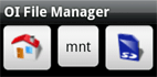
ANDROID NOTE: most Android devices have an accessible folder and file management system. If there is no file management system supplied, OpenIntents file manager can be installed to support the File point operations. |
|
Capture images alongside data with the versatile Camera point, using the convenience of Smartphone and Tablet inbuilt camera.
Design Properties
Design controls shown below:
- Capture method provides options for either built-in camera direct from the Camera point or attachment of the most recent image taken by the device camera and held in gallery , and control of the size of the image captured with built-in camera, which can be important for wireless transmissions
- Capture image size is an important control to select after consideration of the size of image required; 640x480 pixels is the size for presentation on A4 size pages in reports, larger 1600x1200 pixels may be required for more detailed records.
- Folder: on Smartphone containing images from camera, default is \My Documents\My Pictures. However, if the camera doesn't generate or use a 'My Pictures' folder, the path might simply be \My Documents. The default maps to /sd/ in Android and doesn't require change, though this may vary between Android devices. If the nominated folder contains sub-folders, they will also be searched for the latest JPG or PNG image. Some cameras take PNG rather than JPG images and the file type should be set accordingly. Some Windows Mobile Smartphones generate a sub-folder for each day an image is taken, and the Folder path should be \My Documents. Option enables ' Delete the file after storing ' to delete JPG from mobile device after capturing in project session. Note , with some Smartphones this may cause images to be given the same number as the previous image before deletion; test system before using this deletion option.
- Display options: enable tap again to remove image and Thumbnail size: options for image 320x240, 220x160, 160x120
Operation
- with Android Smartphones and Tablets tap point and 'Click to attach image' to launch camera and capture image.
- with Apple iOS iPhone and iPad 'Tap to take Photo' will offer options to 'Take Photo' or 'Chose from Library'. Photo taken or image selected can either be used or retaken. Screen shots from iPhone shown below.
- with Windows Mobile 'Tap to attach image' will launch inbuilt camera.
- in Android , images should be taken in Landscape mode.
- for capture of image to Sketch on image , images should be taken in Landscape mode.
- Please NOTE, with some Android devices , the screen orientation should be locked in Portrait mode before launching the inbuilt camera which normally operates in Landscape mode, and the image should be taken in Landscape mode. The Orientation Lock is located in the device top of screen toolbar/menu. Test before field deployment.
- thumbnail presented on project page.
- option to tap again to remove image.
- image file size determined by camera settings.

|
ANDROID NOTES:
(1) There is considerable diversity in camera function across Android Smartphones and Tablets. The resolution settings of the Android camera should be checked to ensure images are not larger than required back in the office for reports. (2) The Android operating system will only accept up to 1.5 megabyte of data per session (1,500KB), exceeding this limit with large images and/or numerous images may cause lock of the session. Typically, a 640 x 480 pixel image will be about 64KB, more than twenty such images per session could cause session lock with loss of data. Test camera image file size and load test before field deployment of project.
|
Create powerful mobile forms for your business in minutes