Data Presentation Basics
The Chart dashboard item presents data visually using different types of series.
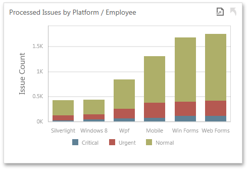
A series represents a grouping of related data points. The most important characteristic of a series is its type, which determines a particular visual representation of data.
The Chart dashboard item includes the following series types.
-
 A
Bar
series displays data as sets of rectangular bars with lengths proportional to the values that they represent.
A
Bar
series displays data as sets of rectangular bars with lengths proportional to the values that they represent.
-
 Point
and
Line
series display data as standalone points or points joined by a line.
Point
and
Line
series display data as standalone points or points joined by a line.
-
 An
Area
series displays data by a line that joins points, and the shaded area between the line and the argument axis.
An
Area
series displays data by a line that joins points, and the shaded area between the line and the argument axis.
-
 A
Range
series is the area between two simple series displayed as a shaded area, or bars that stretch from a point in one series to the corresponding point in another series.
A
Range
series is the area between two simple series displayed as a shaded area, or bars that stretch from a point in one series to the corresponding point in another series.
-
 A
Weighted
series displays data using a third dimension, expressed by a bubble's size.
A
Weighted
series displays data using a third dimension, expressed by a bubble's size.
-
 Financial
series are useful in analyzing stock and bond prices, as well as the behavior of commodities.
Financial
series are useful in analyzing stock and bond prices, as well as the behavior of commodities.
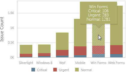
Tooltip
The Chart dashboard item can display a tooltip that shows information on a hovered series point.
Create powerful mobile forms for your business in minutes